Dassau Enterprises Logo and Branding
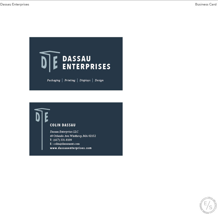
Dassau Enterprises approached me about designing their logo and brand identity. As a newly established packaging company, Dassau Enterprises wanted to establish itself as a one-stop shop for corporate brand packaging needs. The brand needed to compete with much larger competitors such as Stephen Gould, as services the greater Boston area.
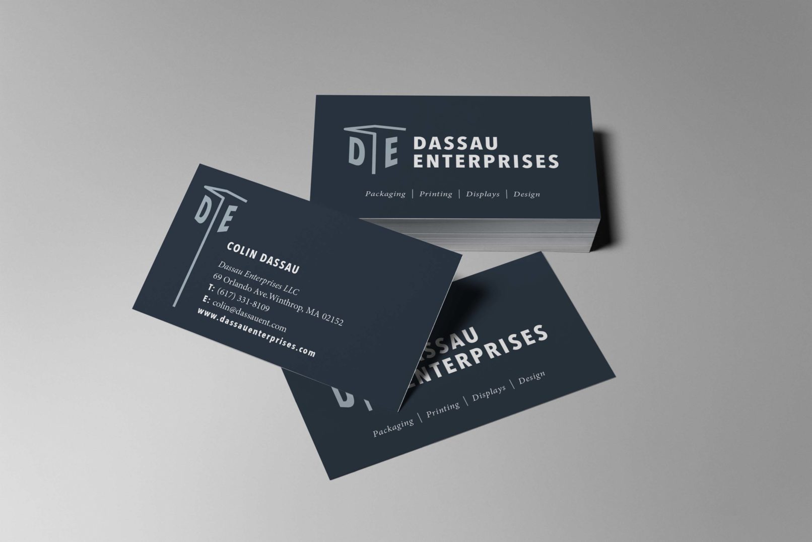
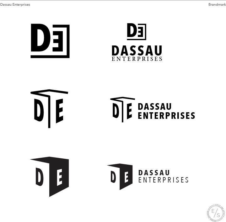
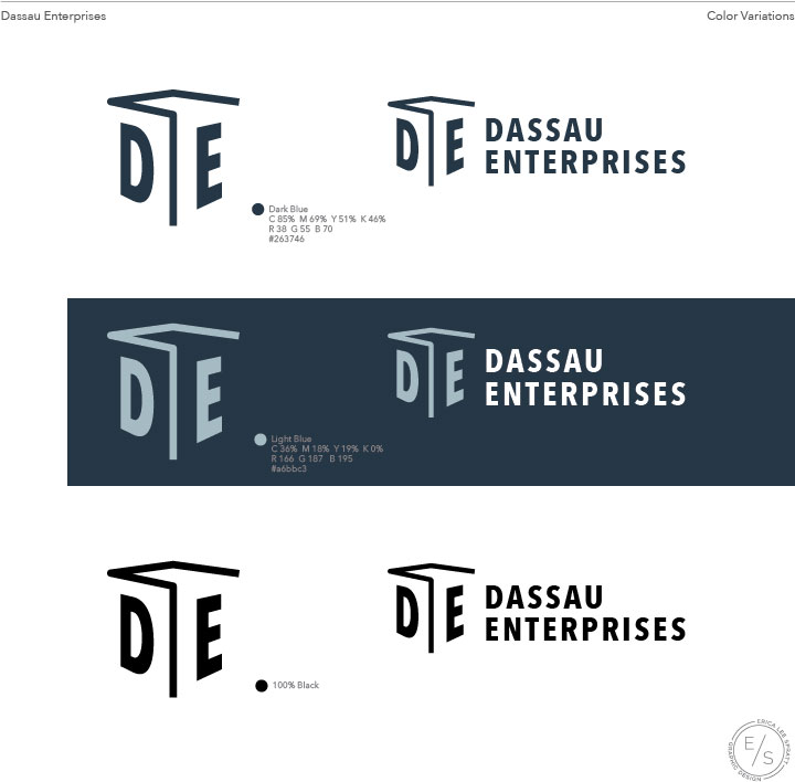
The client liked the idea of using a text treatment to the D and E of the company title. playing off the theme of packaging, while also not ignoring the other aspects of the business such as printing, display, and design, I played with an open design suggesting the structure of a box. Placing the D and E on either side and adjusting for an illusion of perspective gave subtle shape to the logo. The use of a blue color palette invokes trust and authority, while the dark contrast of the navy and bluish grey add a feeling of sophistication.
This is an ongoing project. Check back for updates.


